I was very happy this past Spring when a group of demographers as the University of Wisconsin made available a set of data on county-level migration rates by age and sex and race/ethnicity for the US from 1950 to 2010. This is an incredibly rich source of data and my son, Greg, and I immediately latched onto them to help us put together population projections for Latinos and non-Latinos in the South for a chapter that will be out next year (more on that later). But, lo and behold, they also created some very nice maps, and the website io9 has put them together in a way that nicely visualizes migration patterns over time in the country. Here is an example:
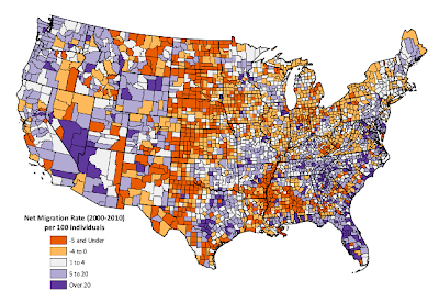
You can see that a lot of the counties shaded in blue (higher in-migration rates) are in the south. This is partly a function of the Great Remigration of Blacks out of the north and back to the south (with the notable exceptions of Alabama and Mississippi), and partly a consequence of a huge increase in the number of Latinos (many of them undocumented immigrants) moving to these states. Over time, of course, this will almost certainly change the demographic and political landscape of the south.

No comments:
Post a Comment